The index and what it measures
The lifetime wellbeing index for a country is its Cantril ladder score (0–10) multiplied by its life expectancy at birth in years. The unit can be read as happiness-weighted life-years: a country where the average person rates their life 6 out of 10 and lives to 75 has an index of 450, while a country where people rate their life equally at 6 but live to 60 has an index of 360.
The two components capture different things. The Cantril score reflects how people evaluate their current lives. Life expectancy reflects how long those lives last, incorporating the effects of nutrition, healthcare, infrastructure, violence, and disease. A country can score identically on the Cantril ladder as another and still have a substantially different lifetime wellbeing index if their life expectancies differ.
Note that life satisfaction and life expectancy are not necessarily uncorrelated; health is itself a predictor of life satisfaction.
Data
Life satisfaction scores are from the World Happiness Report (Gallup World Poll Cantril ladder, 0–10). Total life expectancy at birth and healthy life expectancy (HALE) at birth are from Our World in Data. GDP per capita is from the World Bank via Our World in Data, in 2021 international dollars at PPP.
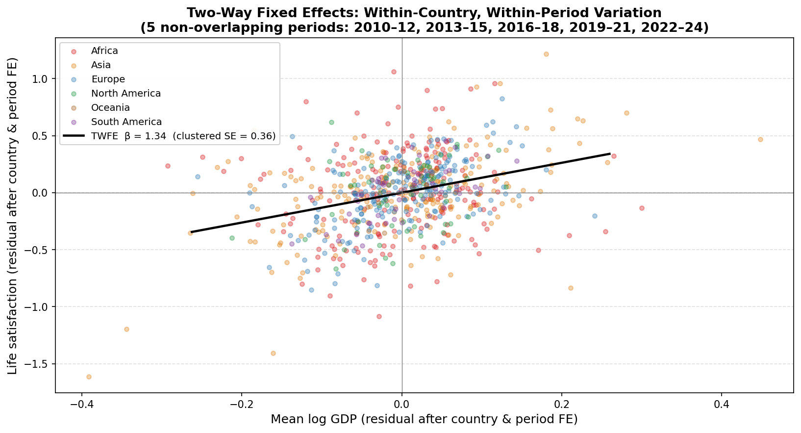
The main analysis uses the same five non-overlapping periods as the Easterlin paradox post: Cantril scores at years 2012, 2015, 2018, 2021, and 2024, each representing the survey average of the preceding three calendar years. For each period, GDP per capita and life expectancy are both averaged over the same three-year window (GDP as a geometric mean, life expectancy as an arithmetic mean). The final panel contains 733 country-period observations across 156 countries. The HALE data ends at 2021, so the HALE version uses four periods (2012–2021) and 586 observations across 155 countries.
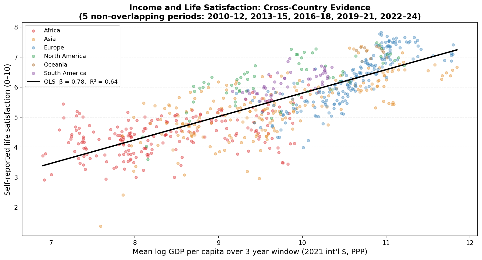
Cross-country relationship
The chart below plots the lifetime wellbeing index against mean log GDP per capita across all 733 country-period observations.
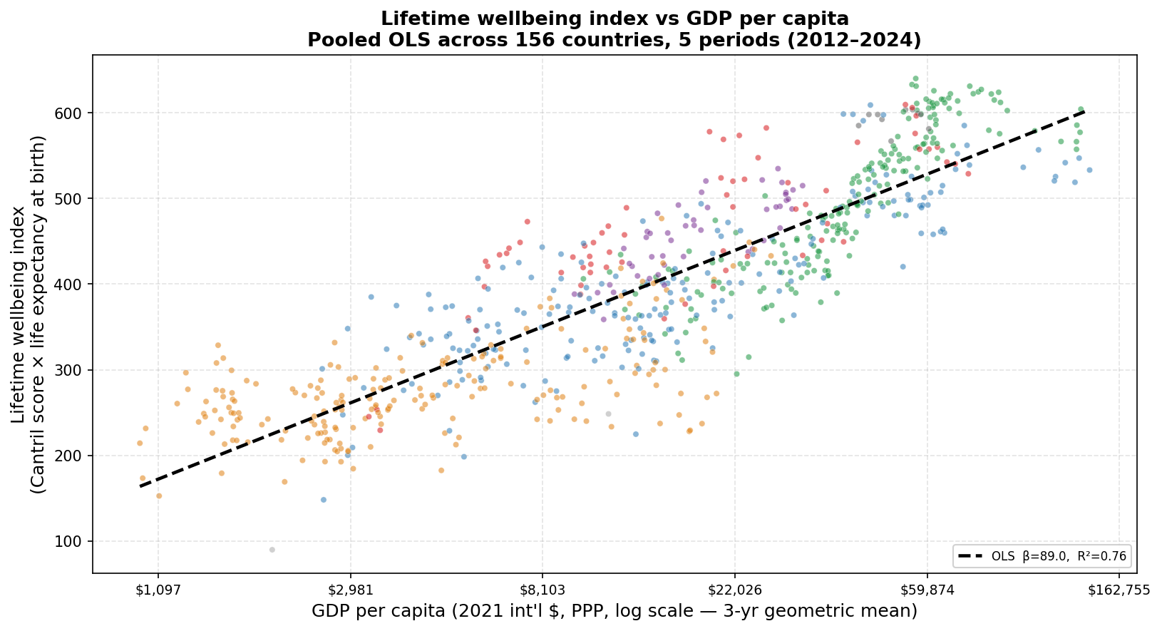
Each point is a country-period. Colors denote world region. The dashed line is pooled OLS (β = 89.0, R² = 0.76).
The pooled OLS slope is 89.0 index points per log-point of GDP, meaning a doubling of GDP per capita is associated with roughly 62 additional units on the lifetime wellbeing index. This could be, for example, an extra decade of life with a Cantril score of 6.2, or an increase of 1 point on the Cantril scale for someone with a life expectancy of 62 (or some combination of the two). The R² of 0.76 is higher than the 0.64 obtained when regressing the Cantril score alone on log GDP, reflecting that income is correlated with both reported wellbeing and life expectancy, so the composite index is more tightly organized around the income gradient.
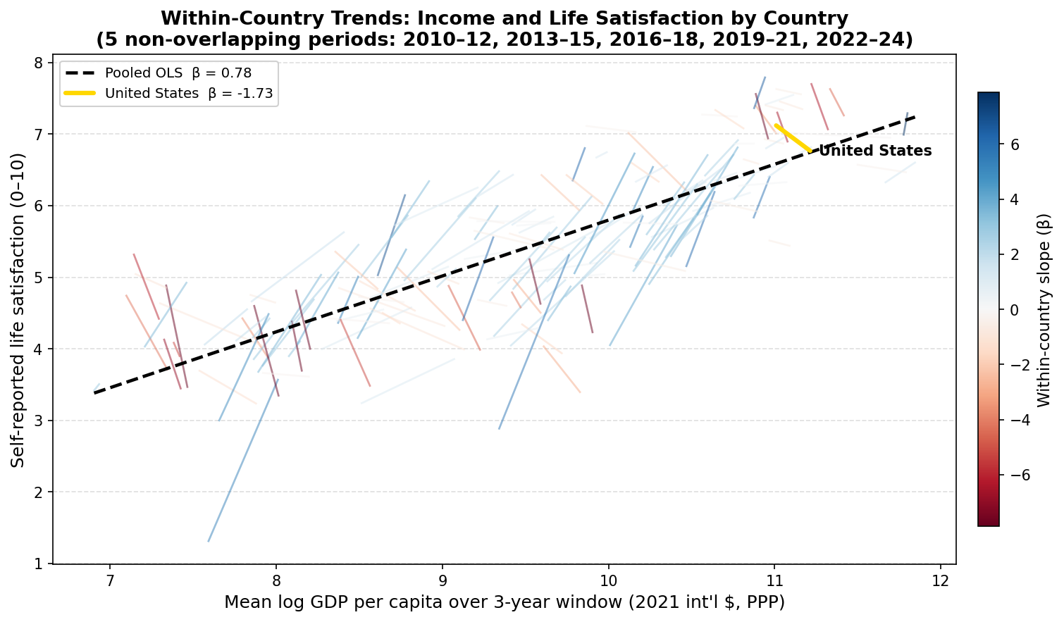
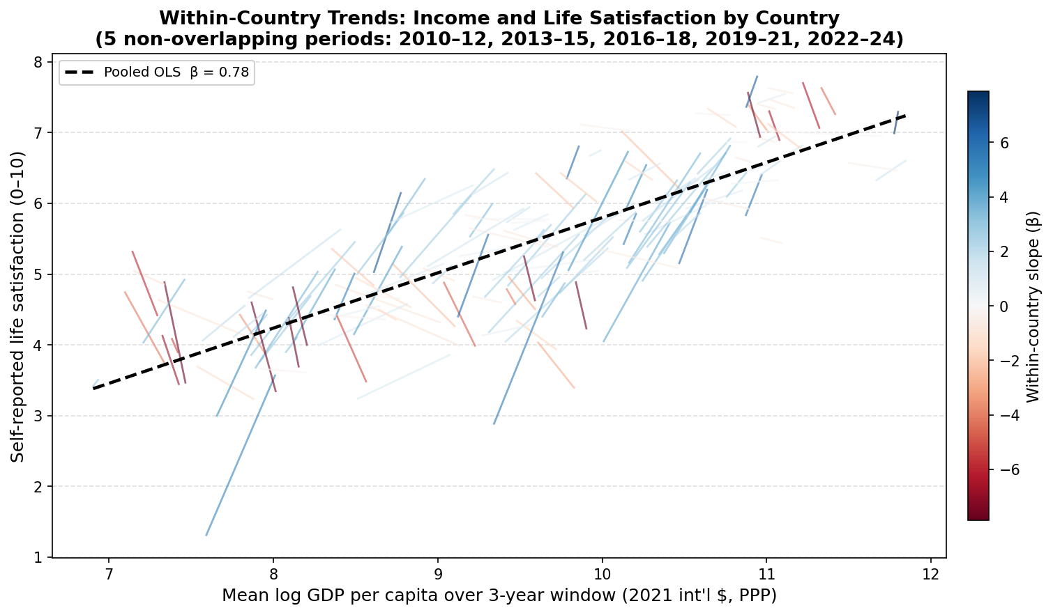
Within-country trendlines
The chart below shows a country-specific OLS fit for each of the 148 countries with at least three period observations. Each line spans that country’s range of mean log GDP per capita across its observed periods. Color encodes the within-country slope: red lines slope downward, blue lines slope upward.
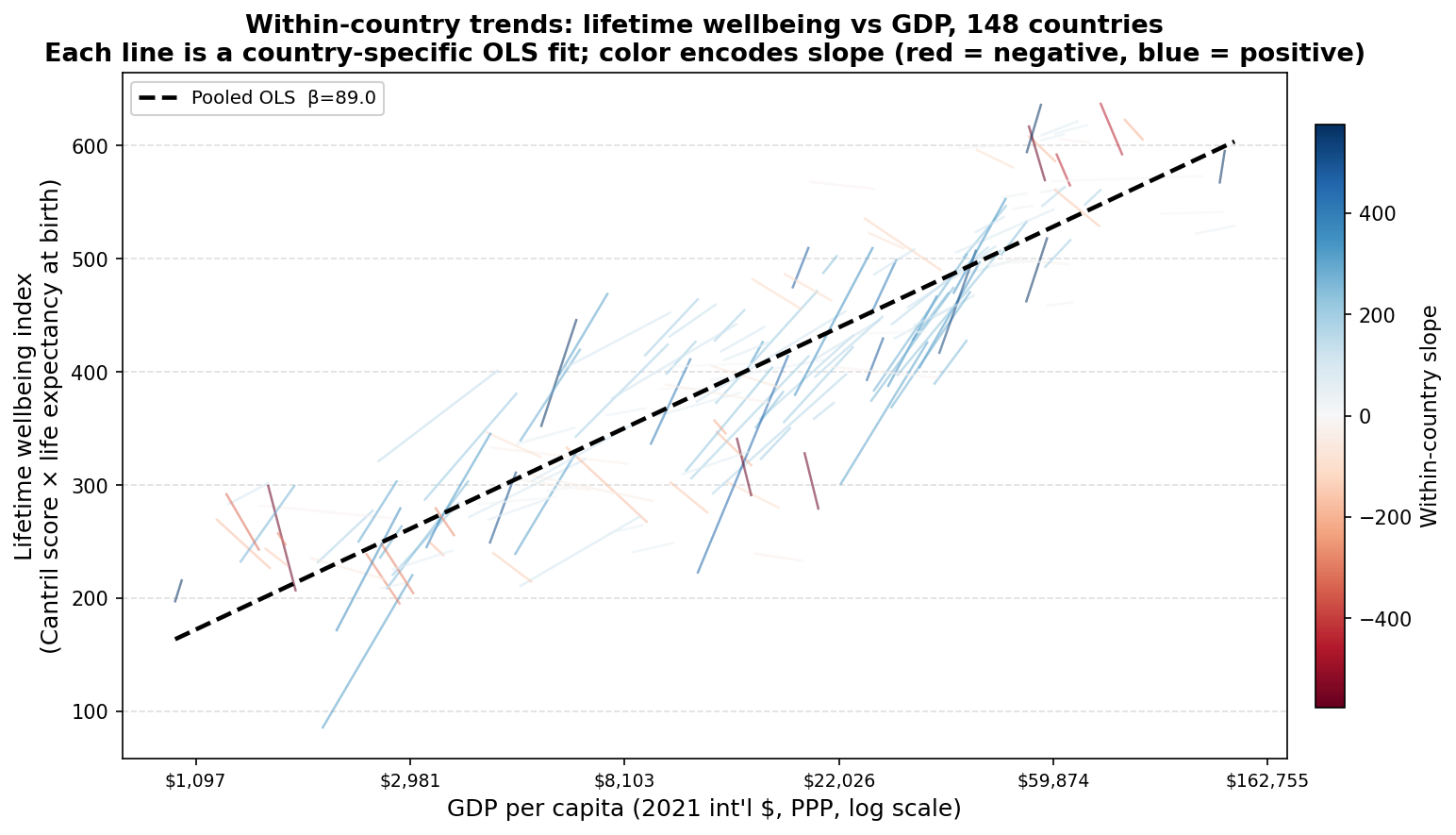
Each line is a country-specific OLS fit. The dashed black line is the pooled OLS from the chart above. Color encodes within-country slope (red = negative, blue = positive).
Of the 148 countries, 107 (72%) have positive within-country slopes. The median within-country slope is 97.1. For comparison, the same calculation on the Cantril score alone yields 59% positive slopes and a median slope of 1.0. The regional pattern broadly mirrors the happiness-only analysis: European countries cluster in the upper-right with predominantly blue lines, while African countries span a wider range of slopes and contribute more of the negative-slope lines.
Distribution of within-country slopes
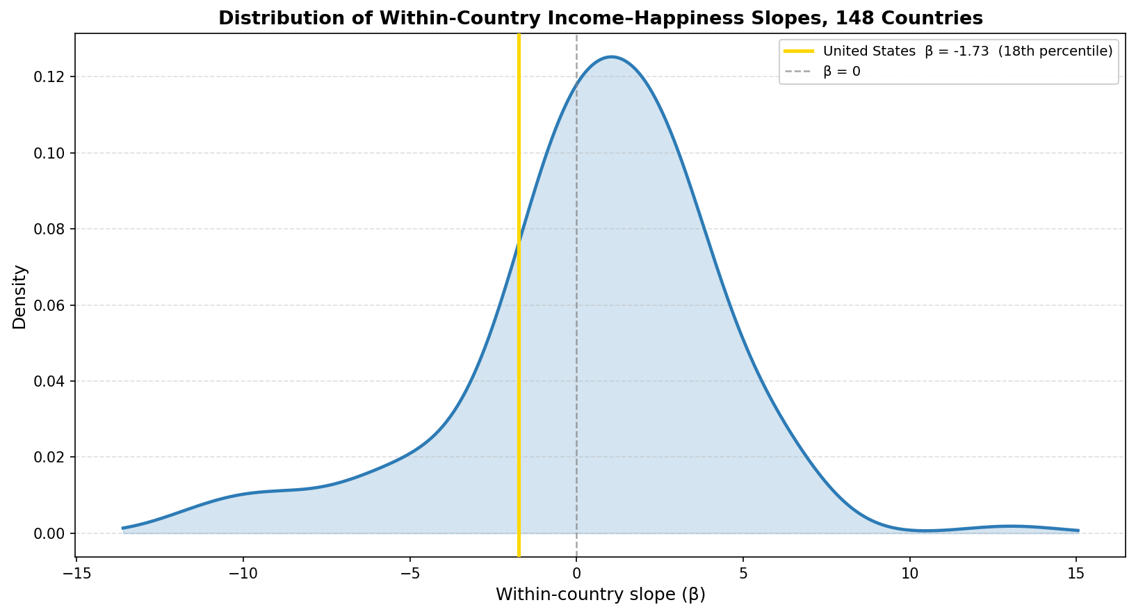
The two charts below show the full distribution of within-country slopes — first for the Cantril score alone, then for the lifetime wellbeing index — using the same design for direct comparison.
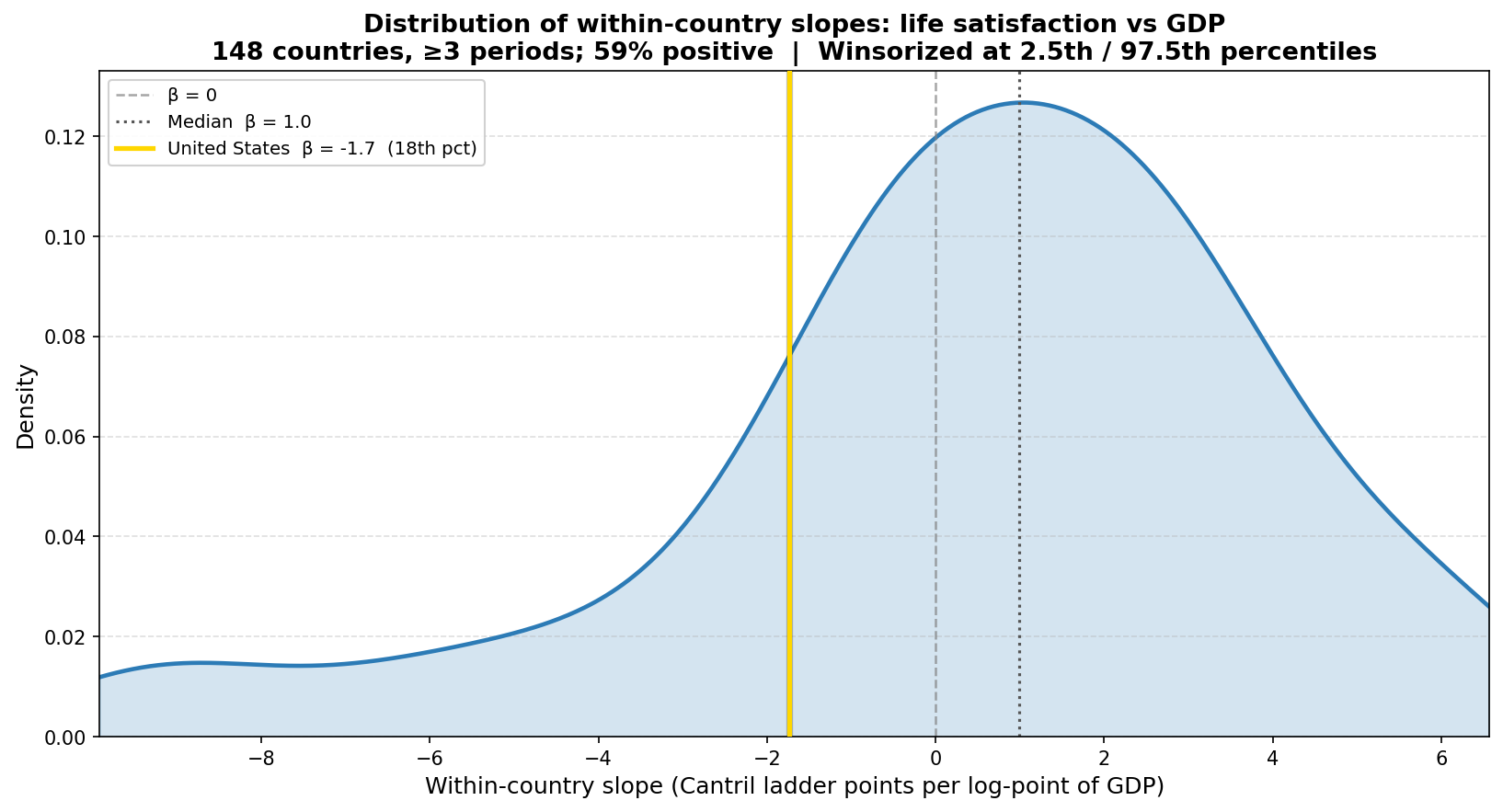
Kernel density estimate of within-country Cantril slopes. The gold line marks the United States (β = −1.7, 18th percentile). The dashed gray line marks β = 0. Winsorized at 2.5th/97.5th percentiles.
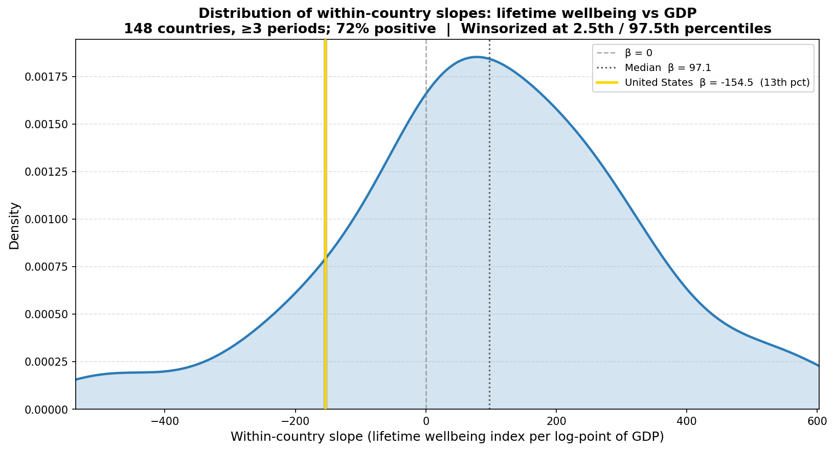
Kernel density estimate of within-country lifetime wellbeing slopes. The gold line marks the United States (β = −154.5, 13th percentile). The dashed gray line marks β = 0. Winsorized at 2.5th/97.5th percentiles.
The happiness-only distribution has a median of 1.0 and 59% positive slopes. The lifetime wellbeing distribution has a median of 97.1 and 72% positive slopes. The x-axis scales are not comparable (the units differ by roughly a factor of life expectancy), but the shape of each distribution and the position of the United States within it can be read directly.
The United States has a within-country Cantril slope of −1.7 (18th percentile) and a within-country lifetime wellbeing slope of −154.5 (13th percentile). Its position moves slightly further into the left tail under the composite index. In the panel, US life expectancy was 78.7 years in the 2012 period and 78.6 years in the 2024 period, a near-zero change, while the cross-country median life expectancy rose from roughly 72 to 75 years across the same periods.
Decomposing the change in lifetime wellbeing
The change in the lifetime wellbeing index between two periods can be decomposed exactly into a life-expectancy contribution and a happiness contribution. If a country moves from (L₁, W₁) to (L₂, W₂), the total change is:
ΔLW = L₂W₂ − L₁W₁ = (L₂ − L₁)W₂ + (W₂ − W₁)L₁
The first term, (L₂ − L₁)W₂, is how much longer life adds — the change in life expectancy weighted by the ending level of wellbeing. The second term, (W₂ − W₁)L₁, is how much happier life adds — the change in wellbeing weighted by the starting life expectancy. The two terms sum exactly to ΔLW.
Applying this to each country’s first and last period observation (2012 and 2024), the chart below plots the happiness contribution on the x-axis against the life expectancy contribution on the y-axis. Each point is one country. Points above the dotted equal-contribution line had LE driving more of the change; points to the right of it had happiness driving more.
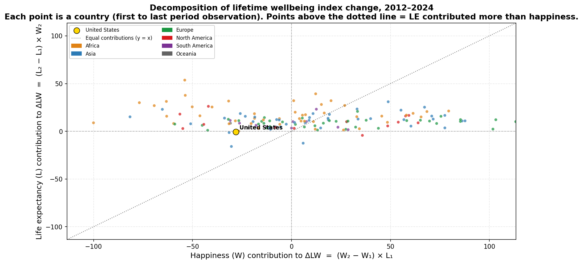
Each point is a country. The x-axis shows (W₂ − W₁) × L₁; the y-axis shows (L₂ − L₁) × W₂. The dotted line marks equal contributions. The United States is shown in gold.
Most countries cluster along the x-axis, below the equal-contribution line: for the typical country, changes in happiness account for more of the total LW change than changes in life expectancy. African countries (orange) sit highest on the y-axis, reflecting large LE gains over the period. The United States sits near the origin on both axes — small negative contributions from both a modest LE decline and a larger happiness decline.
The histogram below shows the distribution of the LE share — the fraction of ΔLW attributable to ΔL — among the 95 countries where the LW index rose.
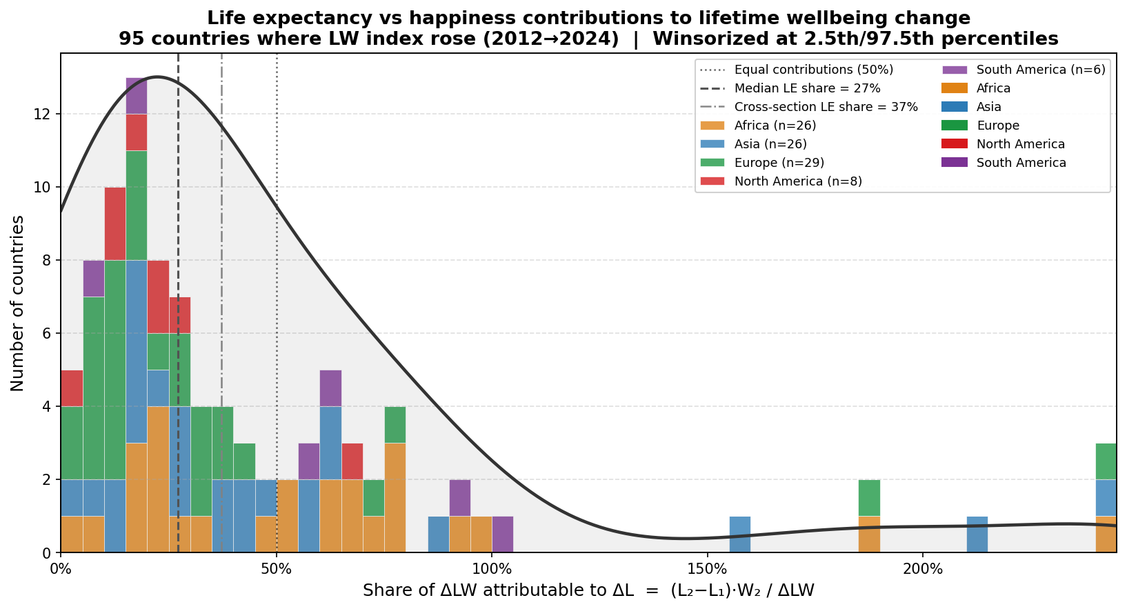
Share of the total LW index gain attributable to the life expectancy contribution, among 95 countries where the LW index rose between 2012 and 2024. The dashed line marks the median (27%). The dot-dash line marks the share implied by the pooled cross-sectional regression decomposition (37%). Winsorized at 2.5th/97.5th percentiles.
The median LE share is 27%, meaning that for a typical country where the LW index rose, roughly three-quarters of the gain came from rising happiness and one-quarter from longer life. The cross-sectional regression decomposition — which asks how much of the relationship between log GDP and the LW index reflects the income–happiness gradient versus the income–LE gradient — gives a somewhat higher LE share of 37%. The distribution is right-skewed: the large LE gains in Sub-Saharan Africa push some countries well above 50%, and nine countries have LE shares above 100% because their happiness fell while LE rose, making the LE contribution exceed the total net change.
For the United States, 98% of the LW index decline between 2012 and 2024 is attributable to the happiness contribution (ΔW × L₁ = −28.2) rather than the life expectancy contribution (ΔL × W₂ = −0.6). Life expectancy was nearly flat (−0.09 years over the full period), so the entire decline in the index reflects falling reported wellbeing.
Alternative measure: healthy life expectancy
Total life expectancy includes all years lived, including years spent with serious illness or disability. An alternative index multiplies the Cantril score by healthy life expectancy (HALE) at birth instead. HALE subtracts years lived in poor health, weighted by severity, so it counts only years in full or near-full health. A country with total LE of 75 and HALE of 65 has ten years of expected severe morbidity; under the HALE index, those years are excluded. This measure is probably more appropriate if we think life satisfaction scores reflect experiences during healthy years of life, and less appropriate if we think life satisfaction scores are an average across a representative sample of different experiences of health in a year, for a given country.
Globally, the average gap between total LE and HALE in the panel is 8.7 years. For the United States, the gap is larger — 12.2 years in the 2012 period, widening to 12.6 years by 2021 — and the absolute level of US HALE declined over the panel, from 66.6 to 64.8 years.
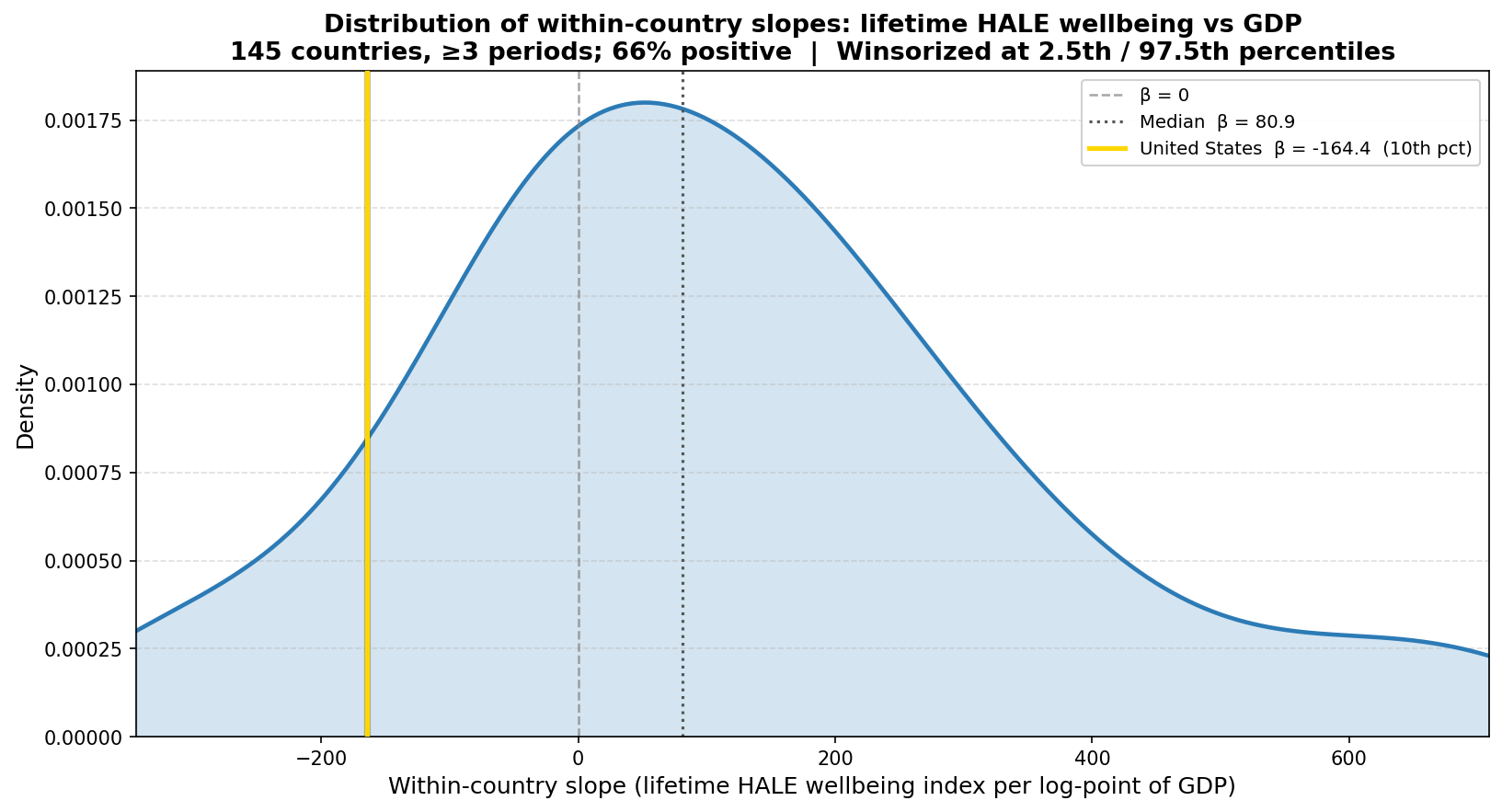
Kernel density estimate of within-country HALE wellbeing slopes. The gold line marks the United States (β = −164.4, 10th percentile). The dashed gray line marks β = 0. Winsorized at 2.5th/97.5th percentiles. Based on 145 countries, four periods (2012–2021).
Under the HALE index, the distribution shifts left relative to the total-LE version: the median within-country slope falls from 97.1 to 80.9, and the share of positive slopes falls from 72% to 66%. The pooled R² is slightly lower at 0.74 versus 0.76, indicating that healthy years track the income gradient somewhat less tightly than total years of life.
The United States falls to the 10th percentile under HALE, compared to the 13th under total LE. The direction is consistent across both measures: the US is in the left tail of the within-country slope distribution under either index. One difference in the regional pattern: North America’s median within-country slope goes from +131.7 under total LE to −26.3 under HALE, and the majority of North American countries shift from positive to negative slopes. The Americas and Oceania show the largest reversals between the two measures; Europe and Asia are broadly stable.
Two caveats apply to the HALE comparison. First, the HALE analysis covers only four periods ending in 2021, which excludes the 2022–2024 window. The US Cantril score reached its low point in the 2024 period, so the four-period baseline places the US at a higher Cantril percentile (26th) than the five-period version (18th); the HALE percentile of 10th should be read in that context. Second, HALE estimates involve more modeling assumptions than total LE and may be less comparable across countries.
Reproducing this analysis
The full code and data are in the total-lifetime-wellbeing repository.
Data
| File | Source | Description |
|---|---|---|
happiness-cantril-ladder.csv |
World Happiness Report / Gallup World Poll | Cantril ladder score (0–10), 3-year rolling averages |
gdp-per-capita-worldbank.csv |
World Bank via Our World in Data | GDP per capita, 2021 int’l $ PPP |
life-expectancy.csv |
Our World in Data | Life expectancy at birth (years) |
healthy-life-expectancy-at-birth.csv |
Our World in Data | Healthy life expectancy (HALE) at birth (years) |
Dependencies
pip install pandas numpy matplotlib scipy
Python 3.9+.
Generating the charts
python3 lifetime_wellbeing.py        # total LE version, 5 periods
python3 lifetime_wellbeing_hale.py   # HALE version, 4 periods
python3 decomposition.py             # ΔLW decomposition charts
Output is saved to output/.
Related: Income and Happiness Across 156 Countries presents the five-period panel this analysis extends — cross-sectional scatter, within-country trendlines, and two-way fixed effects for the Cantril score alone.
Related: The US Happiness Decline in International Context places the US within-country Cantril slope (−1.7, 18th percentile) in the international distribution and examines persistence vs mean reversion.
]]>